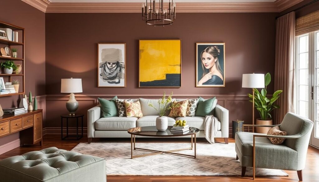
Turning your living space into a cozy spot starts with the right color palette. The colors on your walls can change how your home feels.
There are many paint color ideas out there. Choosing the right ones can be hard. This article will show you different interior design inspirations to make your living area beautiful and in harmony.
We’ll look at everything from calm neutrals to bold colors. These color inspirations can make your home look better. Whether you want to update one room or your whole house, we’ve got you covered.
1. Understanding the Psychology of Color

Understanding color psychology is key to a beautiful and emotionally rich living room. Colors deeply affect our feelings and shape a room’s mood.
The Impact of Color on Mood
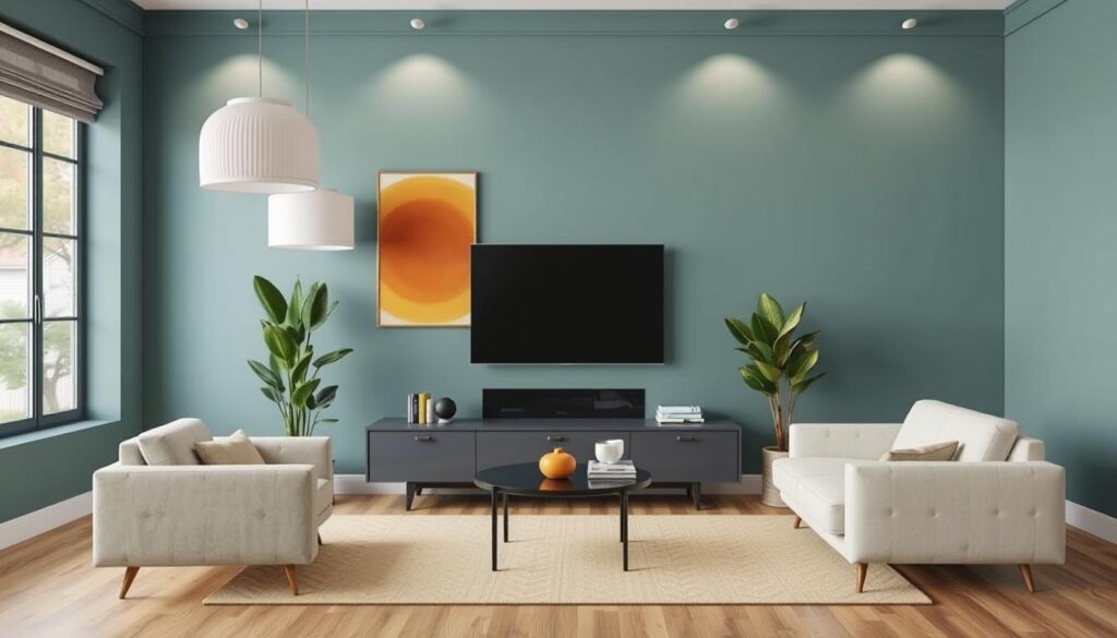
Different colors trigger different emotions. Cool colors like blue and green calm us, bringing peace to a room. Warm colors like orange and red energize, making a space lively.
Think about the mood you want in your living room when picking colors. For calm, use soothing colors in your home decor color schemes. For energy, bold colors make a strong statement.
Choosing Colors for Different Ambiances
The mood you aim for in your living room guides your color choice. Here are tips for modern living room colors for various moods:
- For calm, use soft blues and pale greens.
- For coziness, try warm neutrals like beige and taupe.
- For a bold look, add vibrant colors like coral or turquoise.
By using color psychology in your interior design inspiration, you can make a living room that looks and feels great. Whether you want a peaceful spot or a lively area, the right colors are crucial.
2. Popular Color Palettes for 2023

In 2023, we’re seeing a big shift in color trends. Nature-inspired colors and bold statements are leading the way in interior design. This means earthy tones and striking accents are all the rage.
Earthy Tones: Bringing Nature Indoors
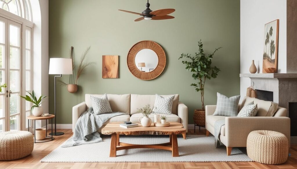
Homeowners are now embracing earthy tones to connect with nature indoors. Shades like sage green, sandy beige, and driftwood grey are calming and natural. They blend well to create a soothing atmosphere in any room.
Here are some ways to use earthy tones in your living room:
- Sage green walls with sandy beige furniture
- Driftwood grey accents and natural wood tones
- Using earthy tones in throw pillows and blankets
Experts say earthy tones are more than a trend. They add warmth and coziness to any space. “Earth tones ground a room and make it inviting,” notes a top interior designer.
“The secret to using earthy tones is to pair them with natural textures. This creates a welcoming and organic feel.”
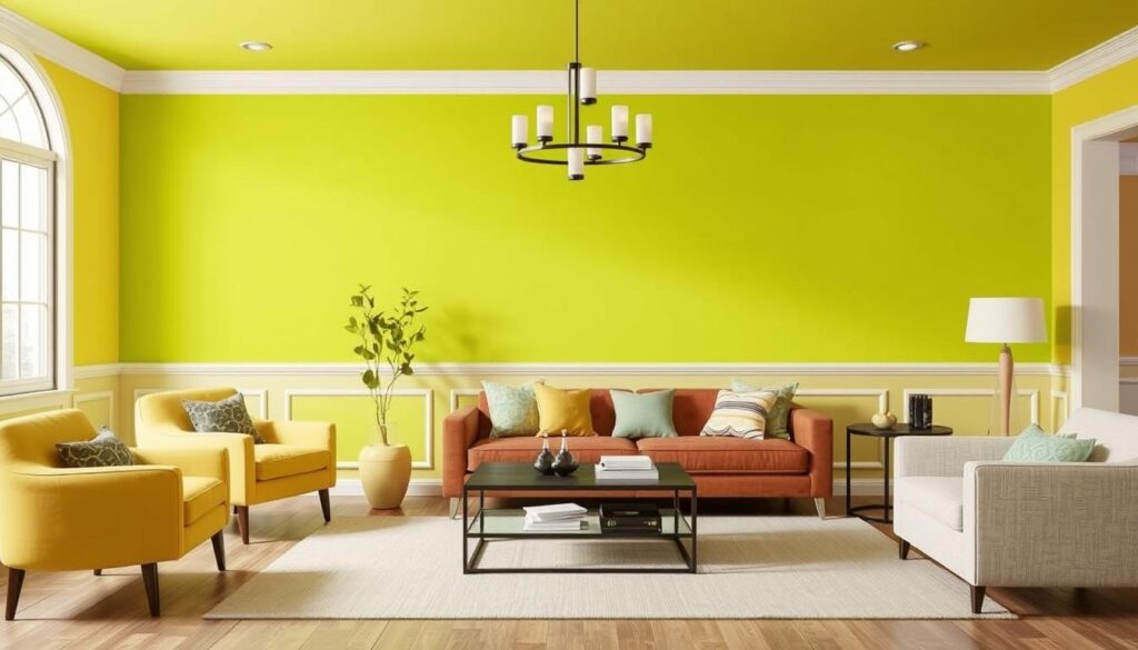
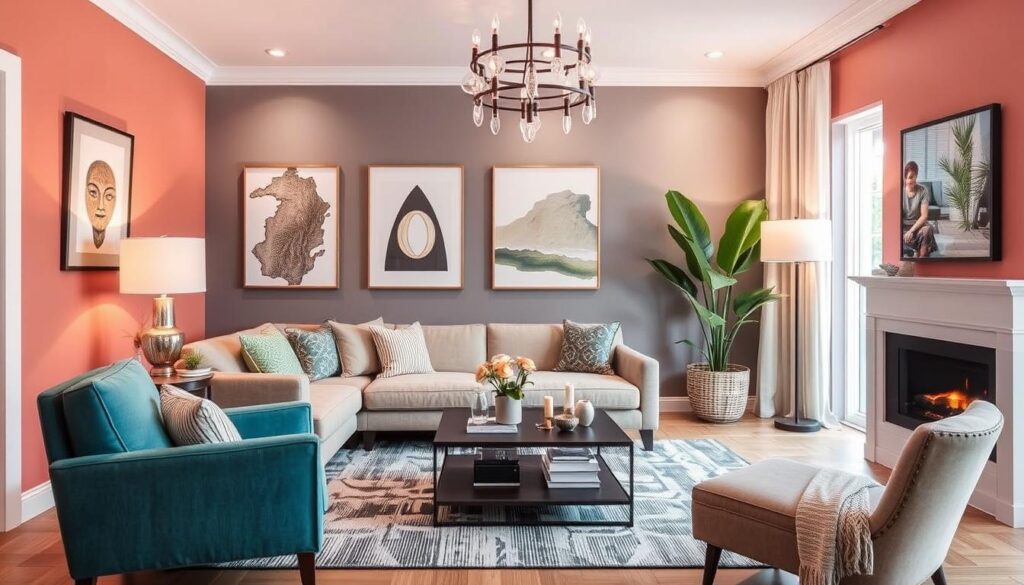
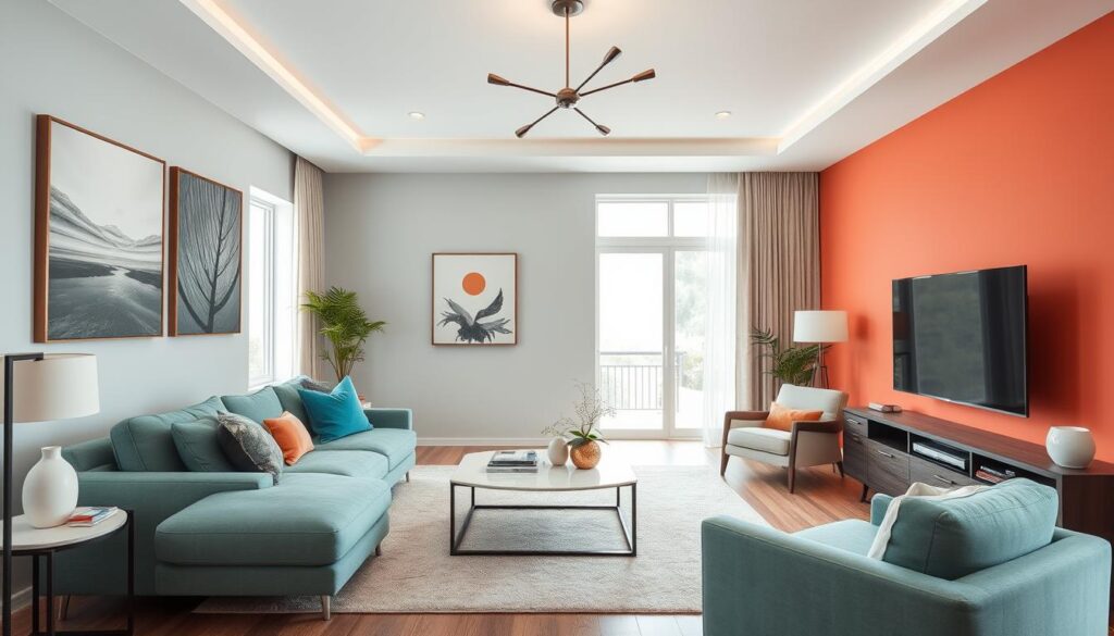
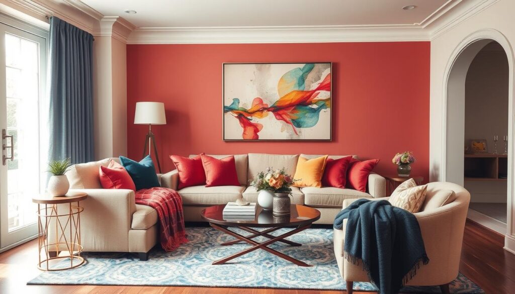
Bold Accents: Making a Statement
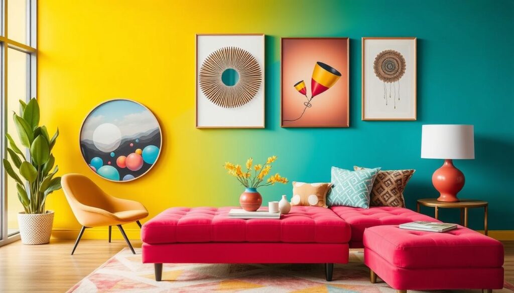
In 2023, bold colors are making a big splash. Vibrant colors like coral red, turquoise blue, and sunshine yellow add excitement to any room. You can use them in furniture, decor, or even a single accent wall.
| Color | Effect | Best Used With |
|---|---|---|
| Coral Red | Adds energy and warmth | Neutral backgrounds |
| Turquoise Blue | Creates calm and serenity | Earthy tones |
| Sunshine Yellow | Brightens the space | Dark or muted colors |
When using bold colors, it’s key to balance them with neutral shades. This avoids overwhelming the space. By mixing bold colors with neutral backgrounds, you get a stylish and modern look that shows off your personality.
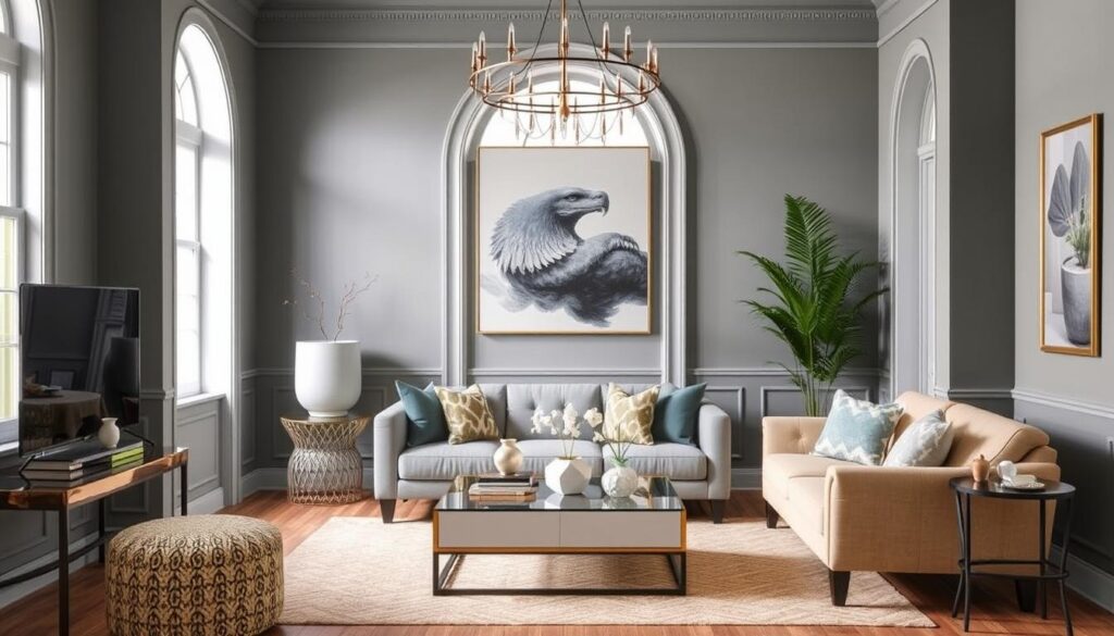
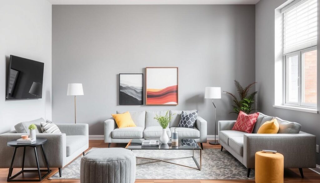
3. Neutral Shades for a Timeless Look

Neutral colors can make a living room look elegant and lasting. Soft whites, beiges, and greys are perfect for a modern look that won’t fade. They keep your space looking fresh for years.
Neutral shades are very versatile. They offer a clean base for adding color through furniture and accessories. This makes it simple to refresh your decor without repainting.
Soft Whites and Beiges
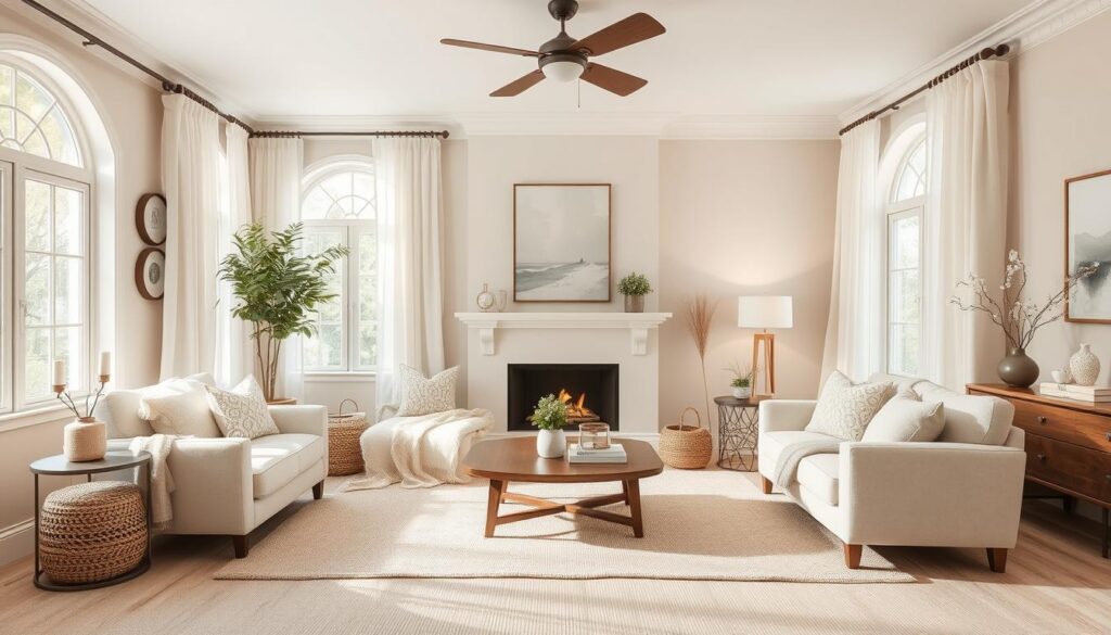
Soft whites and beiges create a warm, inviting space. They blend well, making a soothing palette for a cozy room.
- Soft whites reflect light, making rooms seem bigger.
- Beiges add warmth, balancing the cool tone of whites.
The Charm of Greys
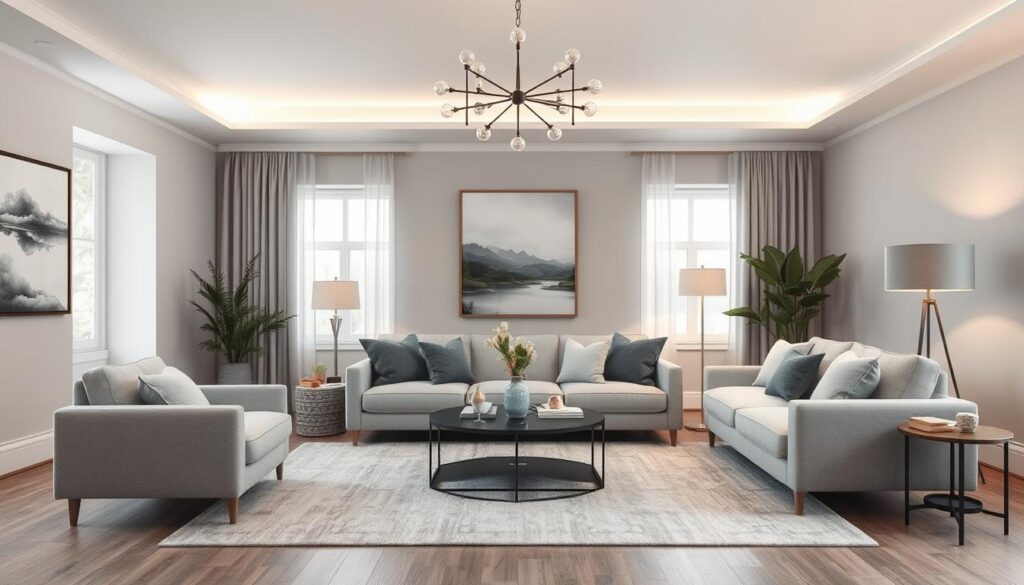
Greys add sophistication to your living room. They come in various shades, from light to dark. This allows for creative decorating ideas.
Some benefits of using greys include:
- Greys pair well with many colors, from bold to soft.
- A grey palette creates a calm, serene space.
Using neutral shades like soft whites, beiges, and greys gives your living room a timeless elegance. They’re perfect for creating a cozy or modern space. Neutral colors are a great choice for your home decor.
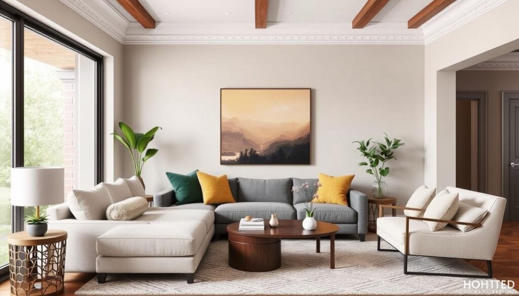
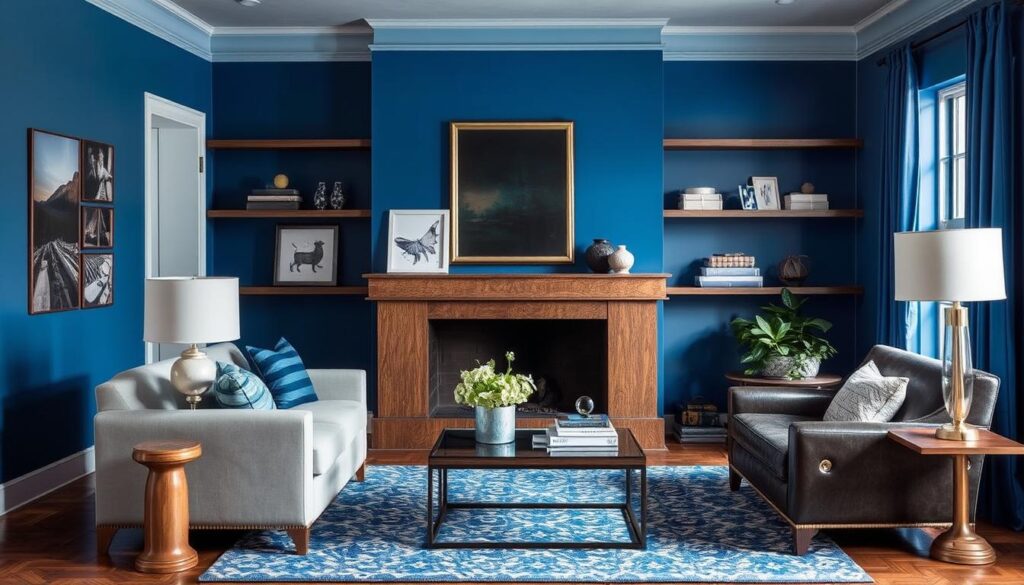
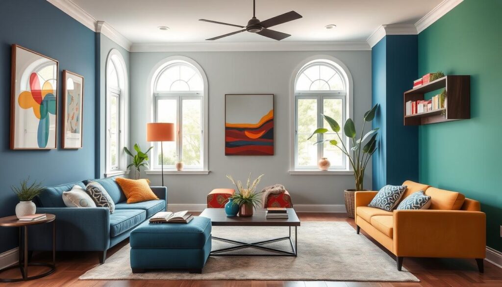
4. Vibrant Hues to Energize Your Space

Adding vibrant colors to your living room can make it lively and welcoming. These colors can wake up your senses and lift your mood. They’re great for areas where you spend a lot of time.
Choosing vibrant hues, blues and greens stand out. They add energy and bring a fresh, calm feel to the room.
Inspiring Shades of Blue
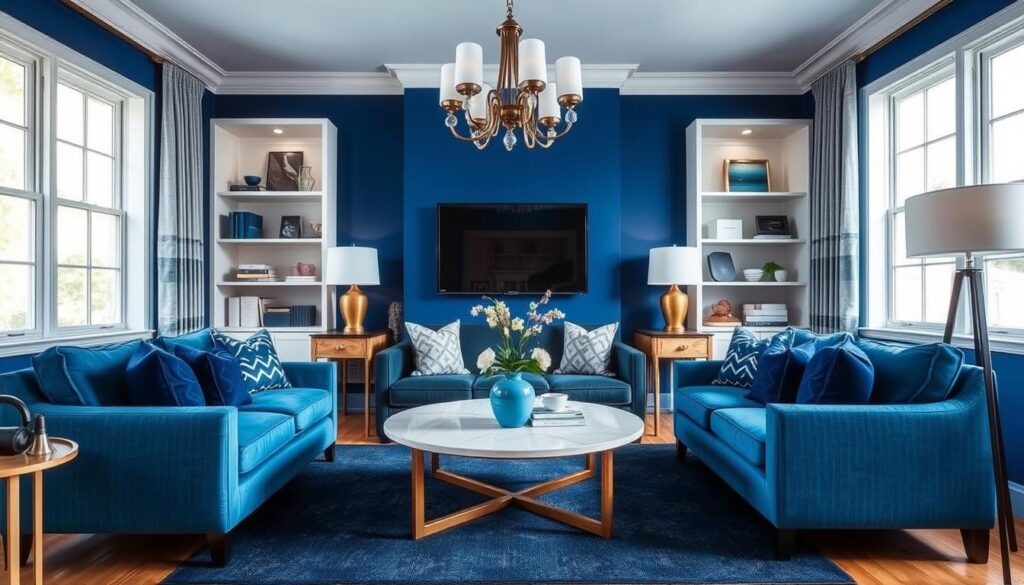
Blue is a versatile color that can be calming or energizing. For a living room, try bold blues like cobalt or navy. Use them on accent walls or in furniture and decor for depth and interest.
“Blue is a calming color that can also be energizing when used in the right shade. It’s perfect for creating a cozy yet vibrant living room.”
Some inspiring shades of blue include:
- Cobalt blue for a bold statement
- Navy blue for a sophisticated look
- Sky blue for a lighter, airy feel
Trendy Greens for Freshness
Green is a vibrant color that brings freshness and vitality to your living room. From minty soft greens to deep forest tones, there’s a green for every style. Use green in accent pieces, plants, or a statement wall.
| Shade of Green | Effect | Ideal Use |
|---|---|---|
| Mint Green | Soft and calming | Accent walls or decor |
| Forest Green | Deep and rich | Furniture or statement pieces |
| Lime Green | Bright and energizing | Accent pieces or accessories |
To use vibrant hues well, balance bold colors with neutral shades. This prevents the space from feeling too much. Try different combinations to find the right mix for your living room.
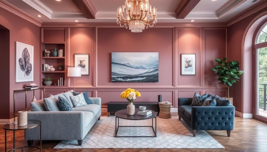
5. Pastel Colors for a Softer Touch

Pastel hues can make your living room feel soft and inviting. These colors help create a calm and relaxed space.
Colors like light pinks, lavenders, mint, and soft peach are great for a serene look. They bring elegance without being too much.
Light Pinks and Lavenders
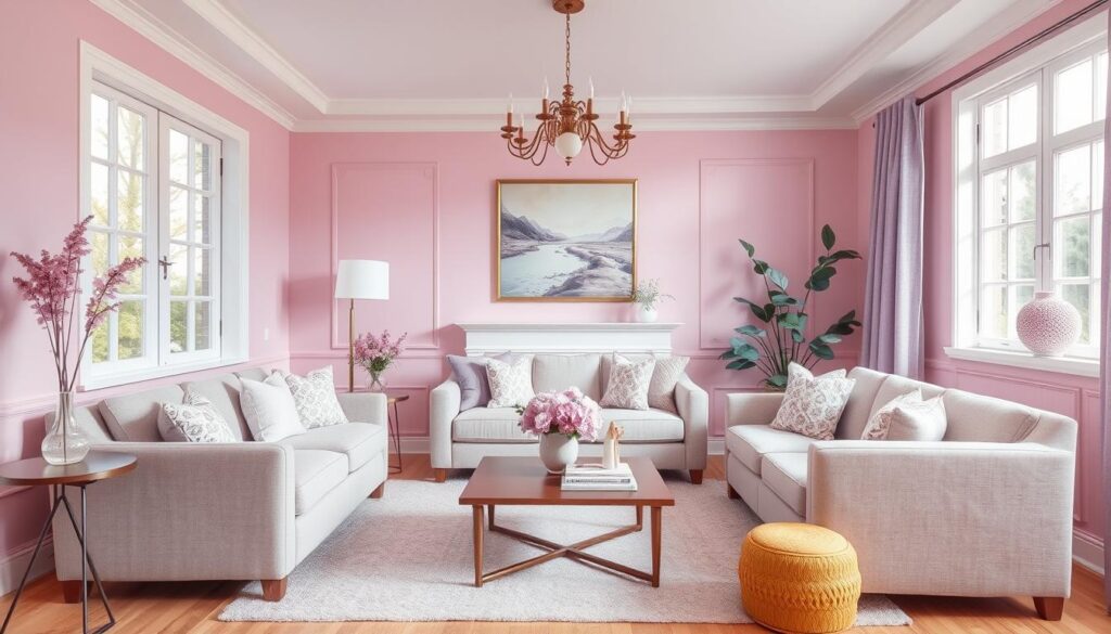
Light pinks and lavenders add warmth and coziness. They work well together or alone for a soothing feel. For example, light pink walls with lavender accents look beautiful together.
Cooling Mint and Soft Peach
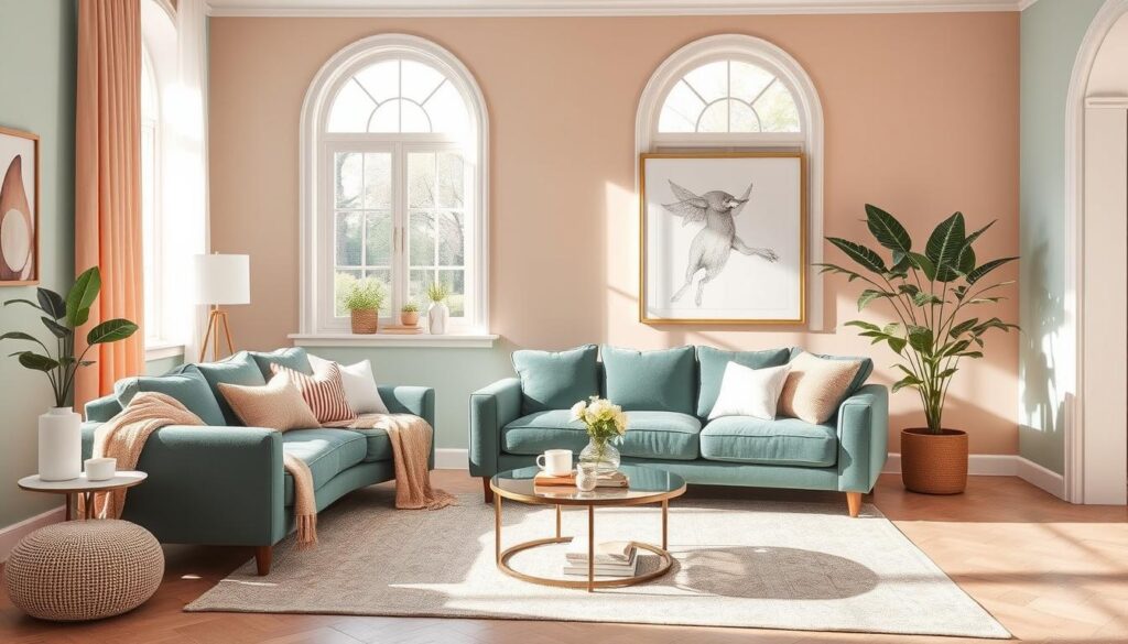
Cooling mint and soft peach also enhance your living room’s calmness. Mint adds a refreshing touch as an accent. Soft peach brings warmth and works well for walls or furniture.
When using pastel colors, balance them with neutrals to avoid too much. Try pastel colors on one accent wall or in accessories like throw pillows and blankets.
For interior design inspiration and more home decor color schemes, check out design magazines or online platforms. They showcase the latest creative decorating ideas.
6. Monochromatic Color Schemes

Monochromatic color schemes are simple yet striking. They use one color to create a cohesive and elegant space. This makes them a favorite for modern living rooms.
Benefits of a Single-Hue Palette
Monochromatic color schemes have many advantages:
- They bring unity and calm to the living room.
- They allow for exploring different textures and tones within one color family.
- They result in a stylish and cohesive look that’s both trendy and timeless.
This style is great for creating popular color palettes that are stylish and easy to keep up.
How to Mix Tones and Textures
To add depth and interest to a monochromatic scheme, mix different tones and textures. You can do this by:
- Using a range of shades within the chosen color, from light to dark.
- Combining various materials and textures, like matte and gloss finishes, or soft fabrics with metallic accents.
For example, a monochromatic blue palette can include light sky blue walls, navy blue furniture, and cobalt blue accents. This creates a dynamic and harmonious look.
| Color Tone | Possible Textures | Example Applications |
|---|---|---|
| Light | Soft fabrics, matte finishes | Walls, upholstery |
| Medium | Wood, leather | Furniture, decorative items |
| Dark | Glossy finishes, metallic accents | Accent walls, accessories |
By mixing tones and textures in a monochromatic scheme, you can create a visually appealing living room. This approach encourages creativity and experimentation. It’s a versatile and appealing choice for updating your living space with modern colors.
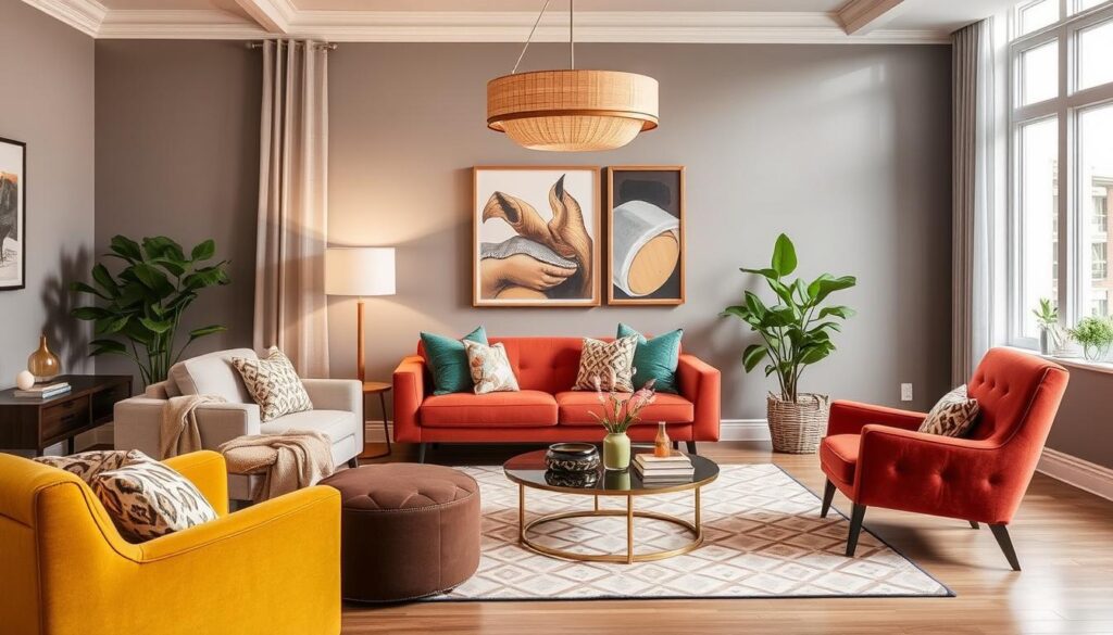
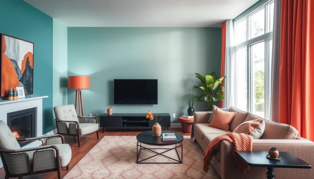
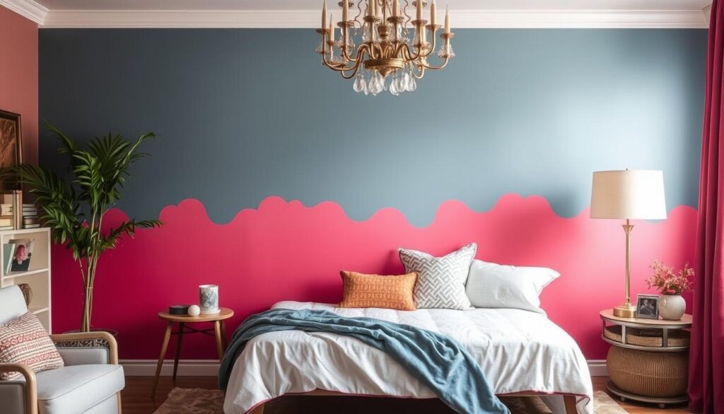
7. Contrasting Colors for Bold Statements

Bold statements in interior design often use contrasting colors. By mixing colors opposite each other on the color wheel, you get a striking living room. It grabs attention and starts conversations.
The Power of Black and White
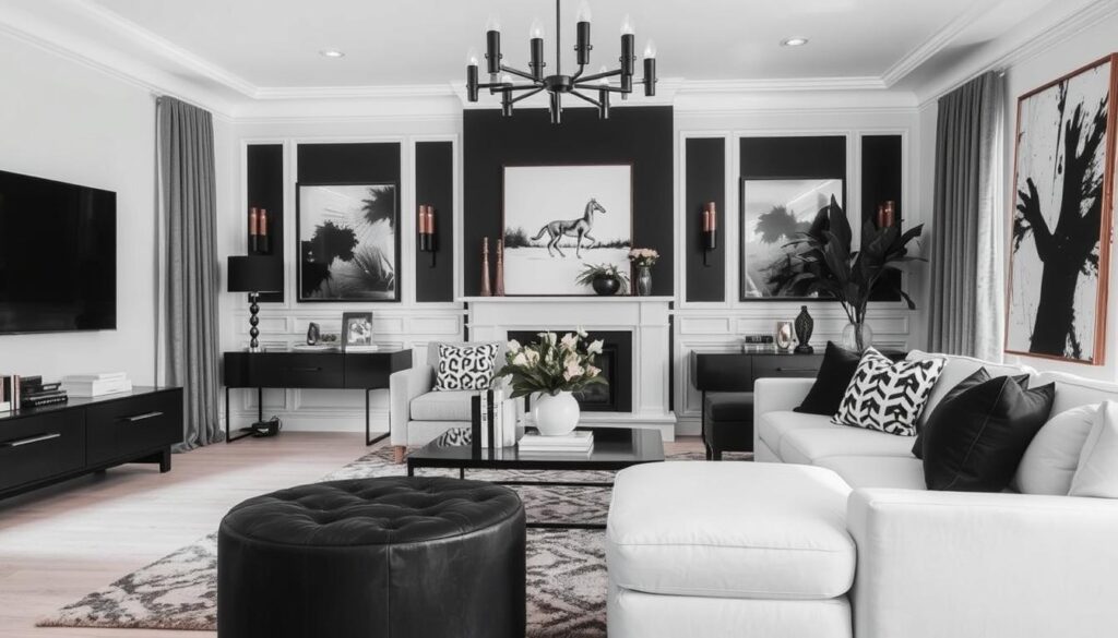
Black and white is a timeless and effective choice. It works in many ways, from bold patterns to subtle textures. Together, they create a sophisticated and modern look that fits any style.
Complementary Colors That Wow
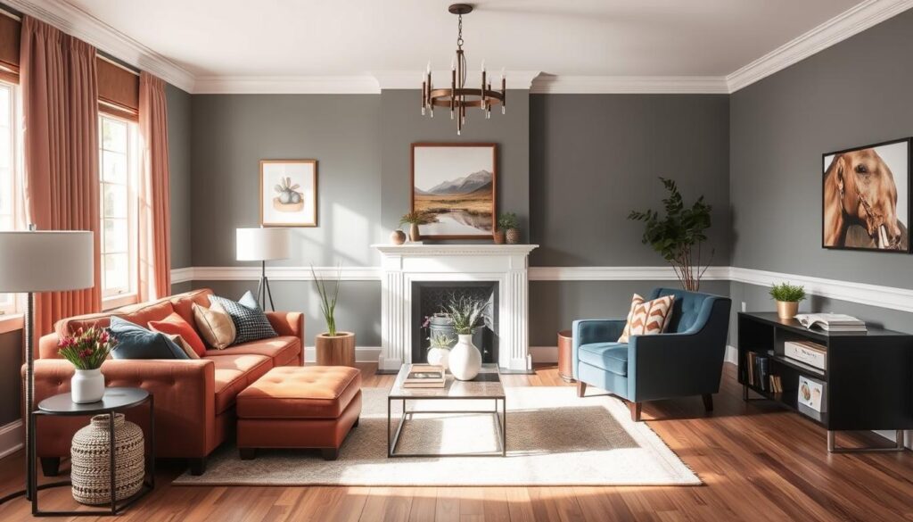
For a bolder look, try complementary colors. These are colors opposite each other on the color wheel, like blue and orange or red and green. Used right, they add depth and energy to your living room, making it vibrant and lively.
To use contrasting colors well, pick a main color and a contrasting or complementary color for accents. This way, you get a balanced and stylish color scheme. It shows off your personal taste and style.
8. Using Accent Walls Effectively

Accent walls can really make a room pop. They turn a dull space into a lively area that shows off your style. By picking the right wall and using creative paint tricks, you can boost your home’s look.
Choosing the Right Wall
Picking the right wall for your accent wall is key. Think about the room’s layout and how people move through it. A wall that naturally catches your eye is usually best. This could be the wall behind a fireplace or a big piece of furniture.
- Look at how visible the wall is and how it fits with the room’s other features.
- Think about the colors and how the accent wall will match or stand out.
- Make sure the wall is clear of things like windows or doors.
“An accent wall can make a room feel more dynamic and interesting by creating a focal point that draws the eye.”
Paint Techniques for Drama
The paint technique you pick can really make your accent wall stand out. You can go for simple colors or try something more like ombre or stenciling. There are lots of choices.
| Technique | Description | Effect |
|---|---|---|
| Ombre | Gradual transition from one color to another | Creates a unique, eye-catching effect |
| Stenciling | Using stencils to create patterns or designs | Adds texture and visual interest |
| Solid Color | A single, bold color | Makes a strong statement |
To really make your accent wall pop, try a high-gloss finish or metallic paint. These can make the wall shine and add depth.
9. Furniture and Decor Color Coordination

The right color coordination between furniture, decor, and walls can elevate your living room’s ambiance. A well-coordinated color scheme can make your living room look more inviting and stylish.
Matching Furniture with Wall Colors
When it comes to modern living room colors, matching furniture with wall colors is crucial. You can choose furniture that complements or contrasts with your wall colors. For a harmonious look, select furniture in a similar hue to your walls, or go for a contrasting color to make a statement.
For instance, if your walls are painted a soft gray, you can opt for furniture in a slightly darker or lighter shade of gray to create a monochromatic look. Alternatively, you can introduce a bold color like yellow or red to add a pop of color.
Accessorizing with Textiles and Art
Accessorizing with textiles and art is an effective way to enhance your living room’s color scheme. Throws, pillows, and rugs can add texture and color to your space. Choose items that complement your wall colors and furniture.
For example, if your living room features a neutral color palette, you can add vibrant colors through textiles like throw blankets and pillows. Artwork can also be used to introduce new colors and create a focal point in the room.
To achieve stylish color combinations, consider the 60-30-10 rule: 60% of the room should be a dominant color, 30% a secondary color, and 10% an accent color. This rule can help you balance your color scheme and create a visually appealing living room.
By carefully coordinating the colors of your furniture, decor, and walls, you can create a beautiful and inviting living space. It will reflect your personal style and provide great interior design inspiration for others.
10. Regional Inspirations and Trends

The charm of regional styles can be seen in the diverse living room color inspirations. Different parts of the world offer unique aesthetic influences. These can transform your living space.
Regional trends add character and style to your home. Let’s explore some of these inspirations. We’ll start with the calming effects of coastal colors.
Coastal Colors for Beachy Vibes
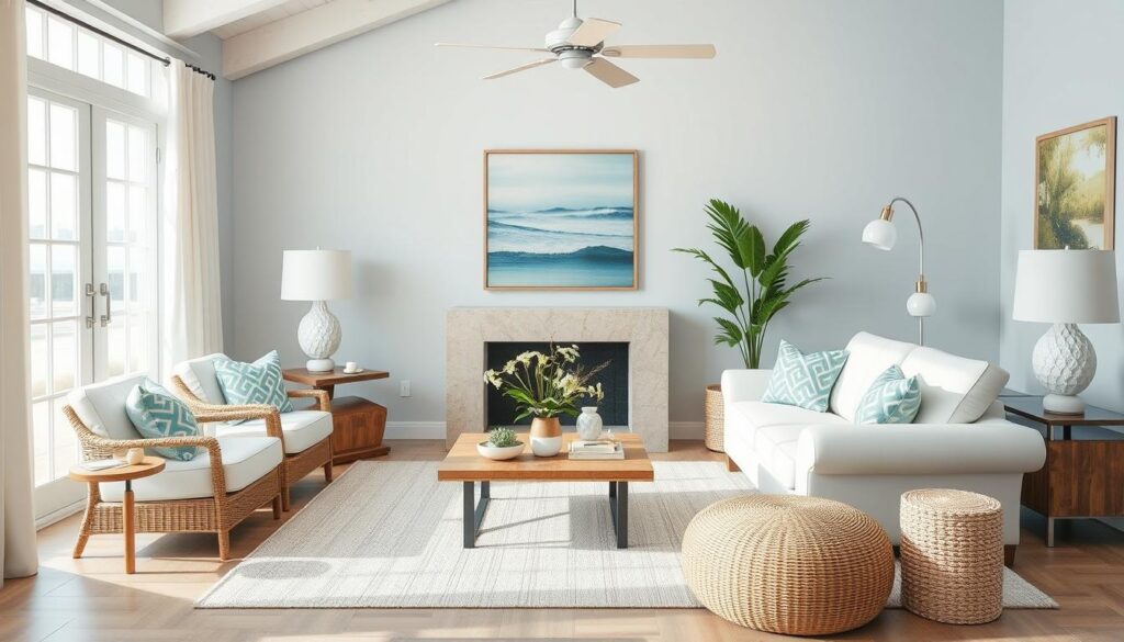
Coastal colors bring beachy vibes to your home. They include soothing blues, crisp whites, and sandy neutrals. These colors evoke the serenity of the seaside, creating a relaxing atmosphere in your living room.
Rustic Hues Inspired by Countryside Homes
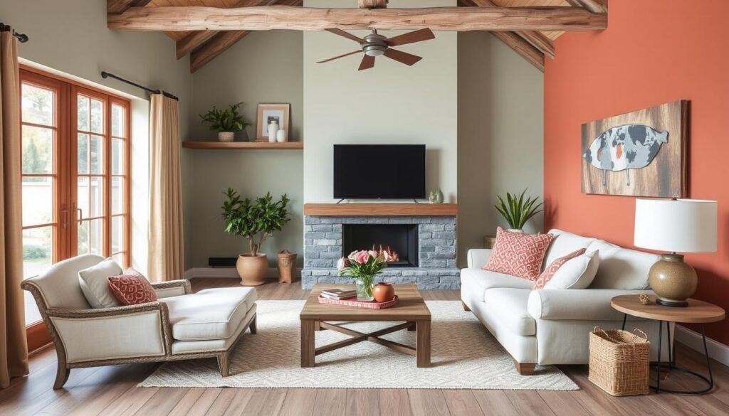
Rustic hues draw inspiration from the countryside. They include earthy tones like terracotta, sage green, and weathered wood. These colors bring warmth and coziness to your living room, reminiscent of a countryside retreat.
By embracing regional inspirations, you can create a home decor color scheme that’s unique. Whether you’re drawn to coastal colors or rustic hues, there’s a popular color palette for every taste.
11. Tips for Experimenting with Color
Trying out new colors in your living room can be exciting and fun. To start, you need the right tools and methods. Using color swatches is a smart way to see how different shades will look in your space.
Effective Use of Color Swatches
When using color swatches, think about your living room’s lighting. It greatly affects how colors appear. Try the swatches at different times to see how they look in different lights. This helps you choose the best color for your room.
Leveraging Online Tools for Color Visualization
Online tools are also very useful for exploring new colors. Many interior design websites and apps let you upload a photo of your room. Then, you can try different colors virtually. This is a great way to find inspiration and see how colors mix, offering valuable design ideas.
By using these methods, you can confidently try out colors. This way, you can make your living room truly reflect your style.
More Living Room Colour Inspirations Ideas