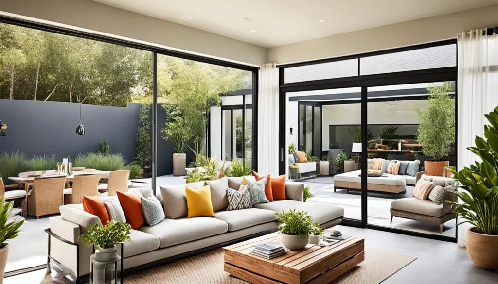
Make your living room show off your style with these living room color combination ideas. Benjamin Moore says this room is where you show your style. So, picking the right colors is very important.
Check out contemporary living room color inspiration from calm earth tones to bold, maximalist colors. You can go for cozy cottage or sleek modern looks. These 20 ideas bring new views to your space.
Try pairing Benjamin Moore’s Gossamer Blue 2123-40 with white for a soothing coastal feel. Or, mix black and gold accents with Black Raspberry 2072-20 for striking contrast.
Earthy neutrals like Brandon Beige 977 mix warmth with elegance. Maximalist colors like Hibiscus 2027-50 bring bold energy. Each living room color combination is both beautiful and practical.
From rustic red walls in Raccoon Fur 2126-20 to soft whites like White Dove OC-17 for open areas. These ideas fit any lifestyle, from calm with sage green and October Mist 1495 to bold with deep regent green.
Let these contemporary living room color inspiration options help with your next update or quick change. They ensure style and function meet. Explore how colors affect mood and space, from sleek black to sunny yellows and purples.
1. Understanding the Psychology of Color
Colors do more than just look good—they affect how we feel. When picking colors for your living room, think about the feelings you want to create. Ask yourself: What kind of vibe do you want this room to have?
The Impact of Colors on Mood
Colors can really change how we feel. Here are some mood-boosting color combos:
- Red: Energizes spaces, great for social hubs (think parties or game nights).
- Blue: Calms and soothes, ideal for reading nooks or relaxation zones.
- Yellow: Adds cheerfulness—perfect for morning rooms or sunlit corners.

Choosing Colors Based on Room Usage
Modern living room color ideas start with function. For a space to host, choose bold reds or warm neutrals. For quiet areas, soft blues or greens are best. Benjamin Moore experts say to use light analysis first. North-facing rooms do well with orange or terracotta tones, while sunlit areas look great with cool grays or sage greens.
Find a balance between function and style. Use neutral walls as a base and add drama with accent pillows or art. Want something bold? A deep blue accent wall can make a big impact without overwhelming the room.
2. Trending Color Palettes for 2023
Check out trendy color combinations for living rooms that blend nature’s warmth with bold creativity. This year, we focus on spaces that feel fresh yet grounding.
Earthy Tones: A Connection to Nature
Designers are embracing stylish living room color trends inspired by nature. The Forest Floor palette combines warm brown, soft yellow, and cool olive green. It’s seen in Meredith Ellis’s Manhattan apartment with blue-green walls.

Sherwin-Williams Persimmon is 2024’s Color of the Year. It adds warmth to earthy neutrals.
Bold Colors: Making a Statement
- Chartreuse walls with purple and camel accents create beautiful color combinations for living spaces like Anna Brockway’s electric Upper East Side design.
- Pair emerald with brass or sapphire with white for timeless contrast.
- Aubergine and citron yellow mix drama with balance.
Benjamin Moore’s Color Trends palette includes Golden Blues and Stormy hues. Bold colors don’t have to be chaotic.
Pastels: Soft and Inviting
| Combination | Effect |
|---|---|
| Dusty Blue + Blush | Calming and airy |
| Mint + Lavender | Fresh yet soothing |
| Peach + White | Warmth with lightness |
Pastels like Brittany Bromley’s olive and peach tones are great for small rooms. Choose muted, modern versions like Benjamin Moore’s Gossamer Blue over bright primaries. Add linen or wood textures to keep spaces grounded.
3. Classic Color Combinations That Never Go Out of Style
Classic color combinations are key to lasting design. Colors like black and white or blue and gray are always in style. They work well with any design, from simple to bold.

“Black-and-white living rooms benefit from textural variety to prevent the space from feeling flat or stark.” — Benjamin Moore’s Design Team
Black and White: Timeless Elegance
Black and white is elegant and works for both modern and traditional rooms. Use white walls with black trim or furniture for a gallery look. Add texture with velvet upholstery, textured rugs, or metallic accents.
For a softer look, try charcoal and cream. Brands like Benjamin Moore offer colors like Northern Night (black) and Crisp Linen (white) for a polished look.
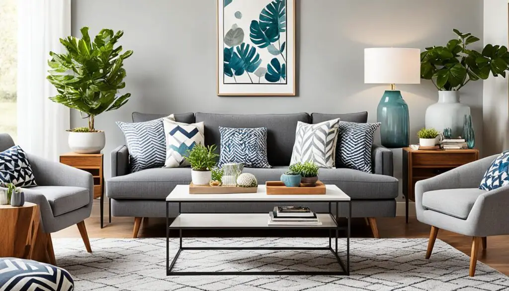
Blue and Gray: Calm and Cozy
Blue and gray schemes bring calmness. Light blues like Farrow & Ball’s Pea Green with soft grays make rooms feel open. For a dramatic look, use navy walls with light gray fabrics.
To add warmth, include wood tones or yellow accents.
| Color Combination | Color Options | Brand Examples |
|---|---|---|
| Black & White | Jet black, ivory, charcoal | Benjamin Moore’s Northern Night, Sherwin-Williams’ Alabaster |
| Blue & Gray | Sky blue, slate gray, navy | Farrow & Ball’s Pea Green, PPG Paints’ Coastal Gray |
Neutrals with bold accents, like Mia Reay’s red against green, add excitement. These classic colors stay popular by mixing style with practicality. Update with seasonal decor or textiles to keep rooms fresh.
4. How to Choose the Right Color for Your Living Room

Choosing the right color for your living room starts with understanding your space. Look at how natural light moves through your room at different times. Harmonious living room color schemes begin with this step. Rooms with little sunlight might need warmer colors to feel welcoming. On the other hand, rooms with lots of sunlight can handle bolder colors.
| Room Direction | Best Colors | Why It Works |
|---|---|---|
| North-facing | Warm neutrals (amber, terracotta) | Counters cool, diffuse light |
| South-facing | Deep blues, rich greens | Strong light balances intensity |
| East-facing | Soft yellows, light greens | Complements morning light |
| West-facing | Oranges, reds | Enhances sunset glow |
“We let the painting’s crimson hues guide every design choice, proving one bold accent can unify a space.” — Andrew Fisher & Jeffry Weisman
Then, look at your furniture. Use neutrals like beige or gray as a base for your color scheme. Follow the 60-30-10 rule: 60% of the color, 30% secondary, and 10% accent. For example:
- Wooden furniture? Pair with soft whites or sage greens
- Patterned upholstery? Choose solid walls in complementary hues
- Vintage pieces? Accent walls in jewel tones add drama without overwhelming
Test colors under different lights—morning, noon, and evening—to see how they change. Remember, the best color schemes honor your space and personal style.
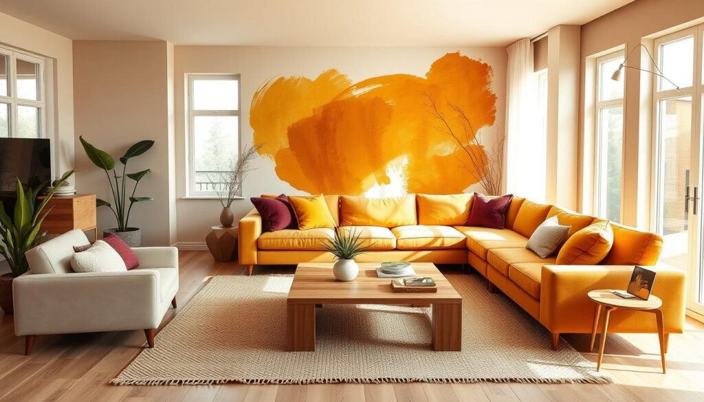
5. Warm Color Combinations for a Cozy Atmosphere

Warm colors like terracotta and amber make living rooms cozy. Today, modern color ideas include layered textures and bold accents. This creates welcoming spaces. Trendy color mixes often combine deep reds with geometric patterns or earthy neutrals to keep small areas inviting.
“A warm palette feels most alive when paired with contrasting materials textures,” advises interior designer Lisa Nguyen, noting how velvet fabrics and metallic finishes enhance deep tones.
Reds and Oranges: Inviting Warmth
Rich reds and oranges are great as focal points. Choose muted shades like brick red or sunset orange to avoid being too intense. Pair them with matte neutrals like linen or oatmeal to balance the boldness.
- Farrow & Ball’s Pelt adds drama as an accent wall, while Benjamin Moore’s Champion Cobalt offers a moody backdrop.
- Try terracotta walls with white trim to blend tradition with modern flair.
Yellow Accents: Bright and Cheery
Yellow accents like mustard or gold add cheer without being too much. Trendy color combinations for living rooms often use small-scale yellows—pillows, lamps, or art—to brighten neutrals.
- Paint an accent wall in Sherwin-Williams’ Cinnabar for a bold splash.
- Soft yellow throw blankets complement dark wood furniture and neutral sofas.
Adding textures like woven baskets or knitted throws makes spaces warmer. Warm lighting and natural wood tones complete the look, making spaces feel both grounded and lively.
6. Cool Color Combinations for a Relaxed Feel

Cool tones like blue and green make your living room calm. They follow stylish living room color trends. These beautiful color combinations for living spaces mix peace with a modern look, ideal for today’s homes.
Shades of Blue: Tranquility in Your Space
Deep blues like Benjamin Moore’s Pacific Sea Teal or Farrow & Ball’s Lulworth Blue add drama. Lighter options such as Farrow & Ball’s Dix Blue bring cheer without being too much. Adding gold accents warms the space.
- Dark Teal: Benjamin Moore’s Pacific Sea Teal for moody depth
- Icy Blue: Farrow & Ball’s Lulworth Blue for fairytale vibes
- Coastal Blues: Benjamin Moore’s British Standard Pompadour with linen textiles
Green Accents: Fresh and Natural
Greens like Benjamin Moore’s October Mist or Emerald Isle bring nature inside. Mix muted greens with neutrals for balance.
- Botanical Accents: October Mist walls with neutral furniture
- Vibrant Accents: Emerald green pillows against beige couches
- Natural Layers: Sage green textiles paired with terracotta pottery
| Color Combo | Colors | Brand & Example |
|---|---|---|
| Green & Neutrals | Sage Green + Portland Stone | Benjamin Moore Raintree Green with Farrow & Ball Portland Stone Light |
| Light Blue & White | Offshore Mist + White | Benjamin Moore Pacific Sea Teal paired with white trim |
| Chocolate & Clay | Deep Brown + Light Clay | Farrow & Ball Deep Reddish Brown with Portola Paints Lute |
Blues and greens with neutrals boost relaxation. For small spaces, soft Benjamin Moore’s Raintree Green on walls makes it airy. Larger rooms do well with Farrow & Ball’s Lulworth Blue ceiling accents. Let these beautiful color combinations turn your space into a peaceful retreat.
7. Tips for Combining Patterns and Colors
Blending patterns and colors needs balance to make spaces feel both cohesive and lively. Start with a rug as your base, picking one that ties your popular living room color palettes together. Then, mix bold patterns like big floral prints with smaller geometric shapes. This adds rhythm without making the room feel too busy.

“Olive lacquered walls provide a delicious backdrop to a eye-catching side chair dressed in a blood orange mohair… floral fabrics balance against structured geometric elements.”
Here’s how to achieve harmony easily:
- Use the 60-30-10 rule: 60% dominant neutral, 30% secondary accent, and 10% bold pattern.
- Mix warm neutrals like greige to unify contrasting styles.
- Pair opposites—like a bold navy stripe with a cream floral—to create striking contrast.
- Layer patterns slowly, starting with a solid wall color before adding textiles.
Benjamin Moore’s Raccoon Fur paired with white shows how stripes and solids can anchor best living room color schemes. For floral and geometric combos, make sure patterns share colors. Big patterns look good on big pieces like sofas, while small geometrics add flair on pillows or curtains.
Remember: repeating shapes or colors ties bold combinations together. Let these tips help make any living space a balanced, welcoming place.
8. Utilizing Accent Walls in Color Combinations
Accent walls make any room stand out without feeling too much. Miles Redd’s use of lacquered blue walls with claret velvet shows how it boosts style. Behr’s 2025 Color of the Year, Rumors, is a modern neutral that pairs well with upholstery or rugs for a unified look.
“The unexpected pairing of lacquered blue walls and a claret velvet sofa asserts a regal look,” notes the Virginia living room by Miles Redd and David Kaihoi, where gold mirrors enhance the glossy surface’s depth.
Choosing the Right Wall for an Accent Color
Choose walls that naturally catch your eye. Great spots include:
- Fireplace walls
- Walls opposite entryways
- Walls flanking a sofa or art display
Avoid walls with big windows or doors to keep the accent strong. Paint shorter walls in deeper colors to make longer walls seem shorter.
Best Practices for Painting Techniques
Modern painting techniques can make accent walls pop. Try:
- Lacquered finishes (like Benjamin Moore’s Van Deusen Blue) for mirrored depth
- Color washing for subtle texture
- Two-tone walls (e.g., Benjamin Moore’s Van Deusen Blue paired with Edgecomb Gray)

LeAnne Hlavka’s designs show how Rumors (Behr’s 2025 hue) works with Wild Ginger and Baronial Brown for a warm, unified space. For DIY, test samples under room lighting to see how colors change. For high-shine finishes, it’s best to hire a pro to avoid mistakes.
9. DIY Color Combination Ideas for Budget-Friendly Makeovers
Beautiful color combinations for living spaces are all about finding balance. You can choose from earthy tones or vibrant colors. Popular living room color palettes can change with your style.
Start with small changes. A throw pillow in deep navy or a gallery wall with contrasting frames can make a big difference. Miles Redd’s Block Island project shows how floral linen and woven rattan can add coastal charm without big renovations.
DIY projects are great for saving money. Painting a mantel lighter or adding rugs under furniture can add depth without spending a lot. You can also try geometric patterns or ombre gradients on walls to test trends without breaking the bank.
Even small swaps can make a big impact. Swapping cushions or repainting flea-market finds can change a room’s look. Projects under $400 show that you can update your space without spending a lot.
Accessories can also make a big difference. A bold vase or striped runner can highlight your color scheme. For lasting changes, try reupholstering chairs or adding textured slipcovers.
Remember, the best color palettes reflect your lifestyle. Mix neutrals with seasonal decor to keep your room fresh. Whether you want a coastal vibe or urban style, these ideas show that beautiful color combinations are possible on any budget.
FAQ
What are some popular living room color combinations?
Classic black and white, soothing blue and gray, and earthy tones like terracotta and moss green are favorites. These schemes suit different tastes and create unique vibes in your living area.
How do I choose the best living room color scheme for my space?
First, think about the room’s natural light and architecture. Also, consider its purpose. Bright colors are great for lively areas, while soft hues are better for relaxing spaces.
What are some modern living room color ideas trending in 2023?
In 2023, look for earthy tones, bold colors, and soft pastels. These modern colors bring a fresh look to your living room.
How do colors affect the mood of a living room?
Warm colors like reds and yellows energize and cozy up a space. Cool colors like blues and greens calm and relax. Choose colors that match the mood you want in your room.
What should I consider when incorporating trending color combinations?
Think about your room’s decor, natural light, and the overall feel you want. Use trendy colors as highlights to add excitement without overwhelming your space.
Can I create a cohesive look with multiple color palettes in one living room?
Yes! Start with a neutral base and add color zones for different areas. Make sure the colors work well together for a harmonious look.
What are some tips for using patterns with color combinations?
Mix stripes and solids for balance, or combine floral and geometric patterns by sharing a common color. This adds interest without chaos.
How can I effectively use accent walls in my living room color scheme?
Pick an accent wall that’s a natural focus, like behind a fireplace. Use deep, rich colors that highlight the room’s features and match the rest of the colors.
What budget-friendly options are there for refreshing my living room colors?
Update with new throw pillows and artwork, or reupholster furniture in fresh fabrics. These changes let you try new colors without spending a lot.
How do environmental factors influence my color choices?
Light and architecture greatly change how colors look. Warm colors can brighten north-facing rooms, while light shades can make dim areas feel brighter.